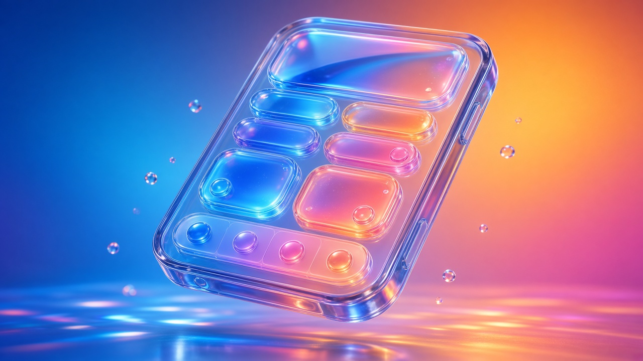
When Apple introduced Liquid Glass at WWDC 2025, it was the biggest visual change to its platforms in over a decade, and also one of the most debated. Designers loved the depth and motion, but many users complained about readability, busy backgrounds and low contrast. A year later, iOS 27 answers those complaints. Apple didn't abandon Liquid Glass; it refined it and handed part of the control to users.
iOS 27 has been available since September 14, 2026. This article explains what changed in Liquid Glass, why it matters, and what UI/UX designers should do differently when designing for iPhone and iPad today.
In short: Liquid Glass in iOS 27 is calmer, more readable and adjustable by each user. Designers can no longer assume one fixed glass look, so layouts must hold up from ultra clear to fully tinted.
A quick recap: what Liquid Glass is
Liquid Glass is Apple's dynamic material for controls and navigation. According to Apple's developer documentation, it blurs the content behind it, reflects the color and light of what surrounds it, and reacts to touch and pointer in real time. Standard SwiftUI components use it automatically, and custom components can adopt it, moving, combining and morphing into one another.
The idea behind it is simple: controls float above content in a separate functional layer, so the content itself gets more space. The challenge has always been the same: glass on top of photos, video and text can hurt legibility.
What changed in iOS 27
Apple announced the changes at WWDC 2026 in June and shipped them with iOS 27 in September. Based on Apple's newsroom and coverage from MacRumors and MacStories, the main updates are:
1. A transparency slider for every user
In Settings, Appearance, Liquid Glass, users can now pick any level between ultra clear and fully tinted. In iOS 26 there were only two choices, Clear or Tinted. MacStories notes that the slider moves between three reference points, More Clear, Default and More Tinted, and that the new Default is on average more tinted than iOS 26's Clear setting.
2. Better diffusion of busy content
Apple tuned how the material handles what is behind it. Complex content like photos and text is diffused more effectively, which improves readability across the system.
3. A darker edge and brighter highlights
Liquid Glass elements now have a darkened edge plus brighter specular highlights. The result is more depth and clearer separation between layers.
4. A uniform bar when content scrolls under it
When content scrolls beneath floating bars, a uniform toolbar band now appears at the top, keeping titles readable. It applies automatically to standard toolbars and can be adjusted through scroll edge effect APIs.
5. Sharper icons and layered icon design
App icons are sharper and more defined, with optional refraction details. Icon Composer, Apple's icon tool, now supports building icons from multiple Liquid Glass layers and previewing how they look on older OS versions.
6. Many improvements arrive automatically
According to MacRumors, apps that already use Liquid Glass get many of these refinements on iOS 27 without being recompiled. Liquid Glass also continues to respect accessibility settings like Reduce Transparency and Increase Contrast.
Why Apple took this route
Liquid Glass divided opinion. Instead of retreating, Apple did two things at once: it made the default calmer and more legible, and it gave people a choice. MacStories describes this as Apple doubling down on both ends of the glass spectrum through customization.
For designers, the lesson is bigger than one material: an expressive visual style only works if it doesn't cost readability. When it does, platforms now hand that control to users.
What this means for designers
1. Stop designing for one glass look. Your screens may be viewed with nearly clear glass or almost solid tint. Check key screens at both ends of the slider, especially over photos, video and bright gradients.
2. Contrast lives in your content too. Glass is calmer, but text and icons placed above rich media still need enough contrast. Avoid thin weights and low-contrast colors on floating elements, and add a subtle dimming layer behind glass sitting on very bright media.
3. Trust the system components first. Standard bars, tab bars, sheets and buttons get Apple's improvements automatically. Every custom glass control you build is one more thing you have to tune and test yourself.
4. Use glass for controls, not content. Liquid Glass belongs to the navigation and control layer. Using it on cards, lists or body content makes interfaces heavy and confusing. Keep content solid and readable.
5. Plan for accessibility settings. Test with Reduce Transparency, Increase Contrast and larger text sizes. These aren't edge cases; they're how many people actually use their phones.
6. Redesign icons with layers in mind. If your app icon is still a flat image, now is a good time to rebuild it as layers in Icon Composer so it looks sharp in light, dark, tinted and clear modes.
7. Mind scroll behavior. Let the system draw the uniform top band when content scrolls under bars instead of forcing old edge styles. Test long lists and image feeds to make sure titles stay readable.
A practical checklist for your next iOS project
- Test key screens at More Clear, Default and More Tinted.
- Check text contrast on floating controls over photos and video.
- Replace custom bars with system components where possible.
- Limit glass to controls and navigation, never body content.
- Test Reduce Transparency, Increase Contrast and Dynamic Type.
- Rebuild the app icon as layers in Icon Composer and preview every mode.
- Review scrolling screens to confirm the top band keeps titles readable.
- Update your Figma kit to show glass at more than one transparency level.
Notes for design handoff
Designers often draw glass in Figma with a background blur and a fixed opacity. That's fine for exploration, but it hides the fact that the real effect is rendered by the system and changes with the user's settings. In handoff, describe intent rather than exact values: which elements are glass, which are solid, how important the text on top is, and which screens need extra contrast checks. Pair with developers to test on real devices early.
Limits and open questions
- Personalization makes QA harder. More user choices mean more combinations to test.
- Rendering differs from mockups. No design tool reproduces the system material exactly, so device testing matters.
- Opinion is still split. Some users want even less glass, and the debate around the style continues.
- Apple's direction may keep shifting. The refinements in iOS 27 show Apple listens to feedback, so expect further tuning in future releases.
Conclusion
Liquid Glass in iOS 27 is a design system lesson in real time. Apple kept its bold idea but made it more readable, more layered and adjustable by each person. For designers, the job is no longer to perfect one glass look; it is to make interfaces that stay clear and usable across every setting a user might choose. Lean on system components, keep content solid, test the extremes and treat accessibility as part of the core design.
Sources
- Major updates for Apple's software platforms are now available, Apple Newsroom (Sept 14, 2026)
- Applying Liquid Glass to custom views, Apple Developer Documentation
- Here's How Liquid Glass Is Changing in iOS 27, MacRumors (June 10, 2026)
- iOS and iPadOS 27: The MacStories Review
Information checked on October 16, 2026.